
There is an overwhelming desire to live more simply and authentically. More people want to consciously strip away the unnecessary and superfluous — to create space for more meaningful connections. The Dulux Colour Forecast 2023 reflects a desire to bond with the environment, or communities and the people with warming, earth-drawn neutrals, natural textures and an array of uplifting brighter hues.
The annual Dulux Colour Forecast is based on year-round research into the latest global and local trends that are predicted to influence New Zealand design. The colour forecast 2023 is led by Dulux colour specialists Davina Harper and Andrea Lucena-Orr in conjunction with Dulux colour forecaster and stylist Bree Leech.
“Colour forecasting for interiors is an evolution,” says Harper. “The palettes we can expect to see in our homes in 2023 are predominantly warm and nurturing, with nature continuing to be a key driver of trends. Brighter hues continue; however, they are deeper than last year.”
Sustainability is another important focus.
“We’re reframing our relationship with material things – it’s no longer enough that a piece is beautiful, it needs to earn its place in our homes,” says Leech.
“Sustainability is beginning to feel more personal; we don’t just want to know that pieces are made in a way that’s gentle on the environment, but to understand the journey they have taken before arriving in our lives. As a result, there continues to be a renewed interest in the handcrafted and pieces with a story to tell,” she says.
The three palettes in the Dulux Colour Forecast 2023 reflect differing needs, to create beautiful living spaces that reflect where you are in your life’s journey.
Dulux Balance is a refined palette of serene marine blues, gentle greens and accents of deep garnet that evokes the beauty and fluidity of the ocean and shoreline.
“Balance is very much inspired by a ‘less is more’ philosophy, with minimal detailing and a restrained approach to decorating. Instead, the focus is on immersive colour and the beauty of complex, structured patterns found in nature, such as a simple seashell or fern frond,” says Leech.
Luxe textures, such as velvet and silk, furniture with exaggerated, curved silhouettes, abstract art, and décor pieces with organic shapes and delicate pleating complete the look.
“Balance has an elegant, understated feel that would work beautifully in an inner-city apartment or a terrace home,” she says.
With its warm, earthy tones of moss, wasabi, sandstone, muddied yellow-green and burnt charcoal, the Dulux Connect palette is all about fostering our relationship with the great outdoors.
“It speaks of calm. Muddied yellow-green has something of a nostalgic, country house feel, cinnamon is grounding, whilst rich, warm brown adds an indulgent and contemporary twist,” says Harper.
Simple, rustic furniture in timber, leather and rattan sits alongside stone flooring and bespoke, modern lighting made from recycled materials for a look that simultaneously speaks of the past, present and the future.
“The palette could look incredible in a cosy dining room or living area of a family home or a Kiwi bach,” she says.
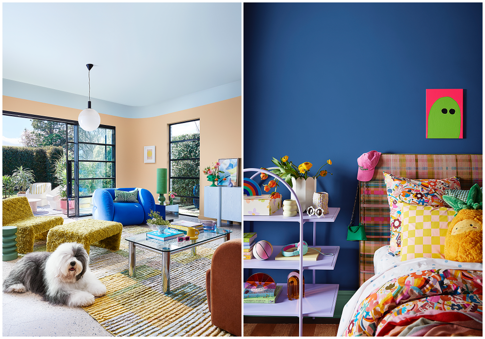
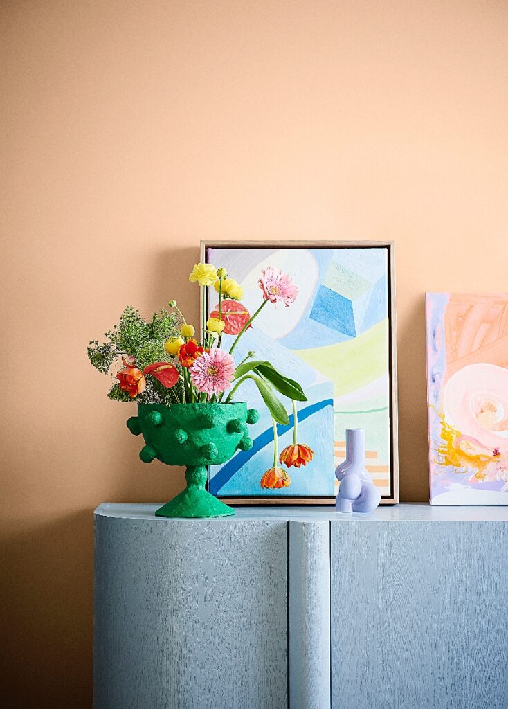
Filled with playful, uplifting brighter colours, such as rose pink, breezy blue, sunshine yellow, emerald, violet and burnt orange, the Dulux Revive palette is an instant mood-lifter. With unexpected colour combinations, graphic floral patterns and furniture in cloud-like forms, the message is clear: interiors shouldn’t be taking themselves too seriously in 2023.
 Integration tips
To introduce colour, try painting the skirting boards or architraves in your living room, the edge of a door, the back of a bookshelf, a bedhead in your child’s room, or breathe new life into an old lamp base, chair or front door with a coat of paint. You’ll find that colour really makes a house a home – once you get started with paint colours, you’ll never look back!
Before you start painting, it’s crucial when selecting colours for walls or soft furnishings that you consider other fixtures and fittings in your space that you can’t change easily – it might be carpet, tiles, laminate or stone, and/or curtains and blinds that you will need to ensure work with the new colour(s) chosen.